Team England
Ready to Win.
About the project
What
Brand immersion
Brand strategy
Brand identity
Brand guidelines
Brand implementation
How
Brand idea - Ready to Win.
The Challenge:
The next Commonwealth Games will be held in Glasgow in 2026. With big ambitions for the Games, Team England needed a new identity to ignite national pride and channel athletic spirit in equal measure.
We wanted to strengthen awareness, cohesion and distinctiveness for Team England, giving athletes, staff, volunteers and fans a powerful symbol to rally behind. Copy and creative had to reflect the diverse nature of Team England, while instilling a sense of collectivity and unison in the build up to the Games.
The Solution:
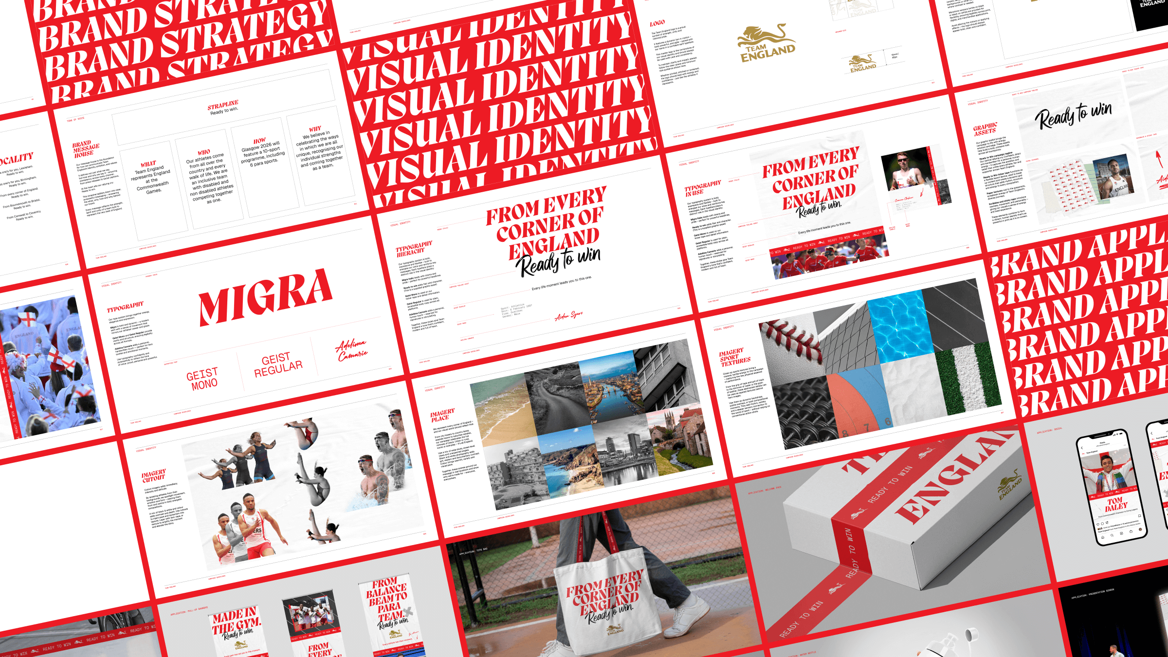
We wanted to land a core message that could act as the foundation for how the entire team identity is communicated. ‘Ready to Win’ anchors the new identity and is shown visually as a handwritten statement of intent that shows both personal drive and collective belief. It encapsulates the power of resilience, ambition and determination by looking beyond appearances or backgrounds to shine a light on the preparation, belief and passion behind every athlete.


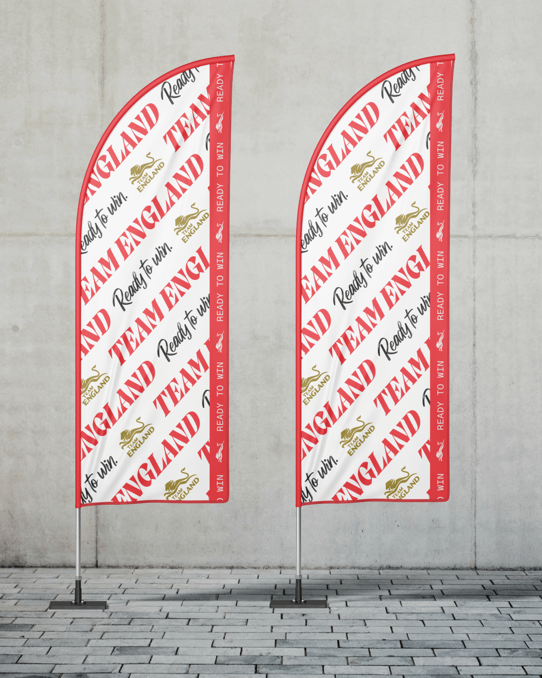
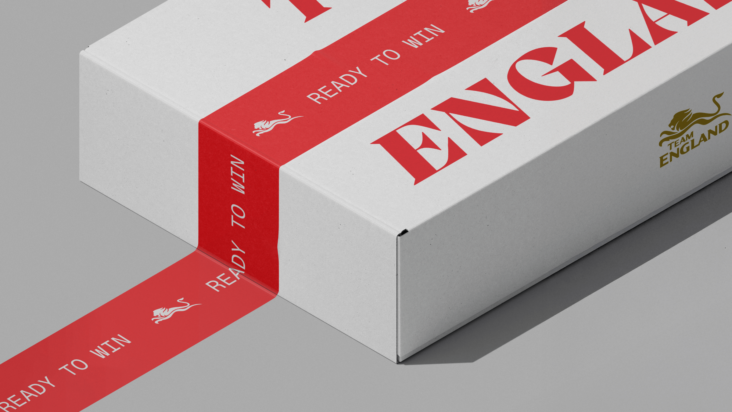
The Team England logo – a dynamic lion in motion – remains at the heart, with a new signature gold colourway reinforcing excellence and heritage. Secondary red and monotone versions of the logo ensure flexibility and contrast across digital, print and merchandise. Each execution has been designed to retain impact, whether printed, stitched or screened.
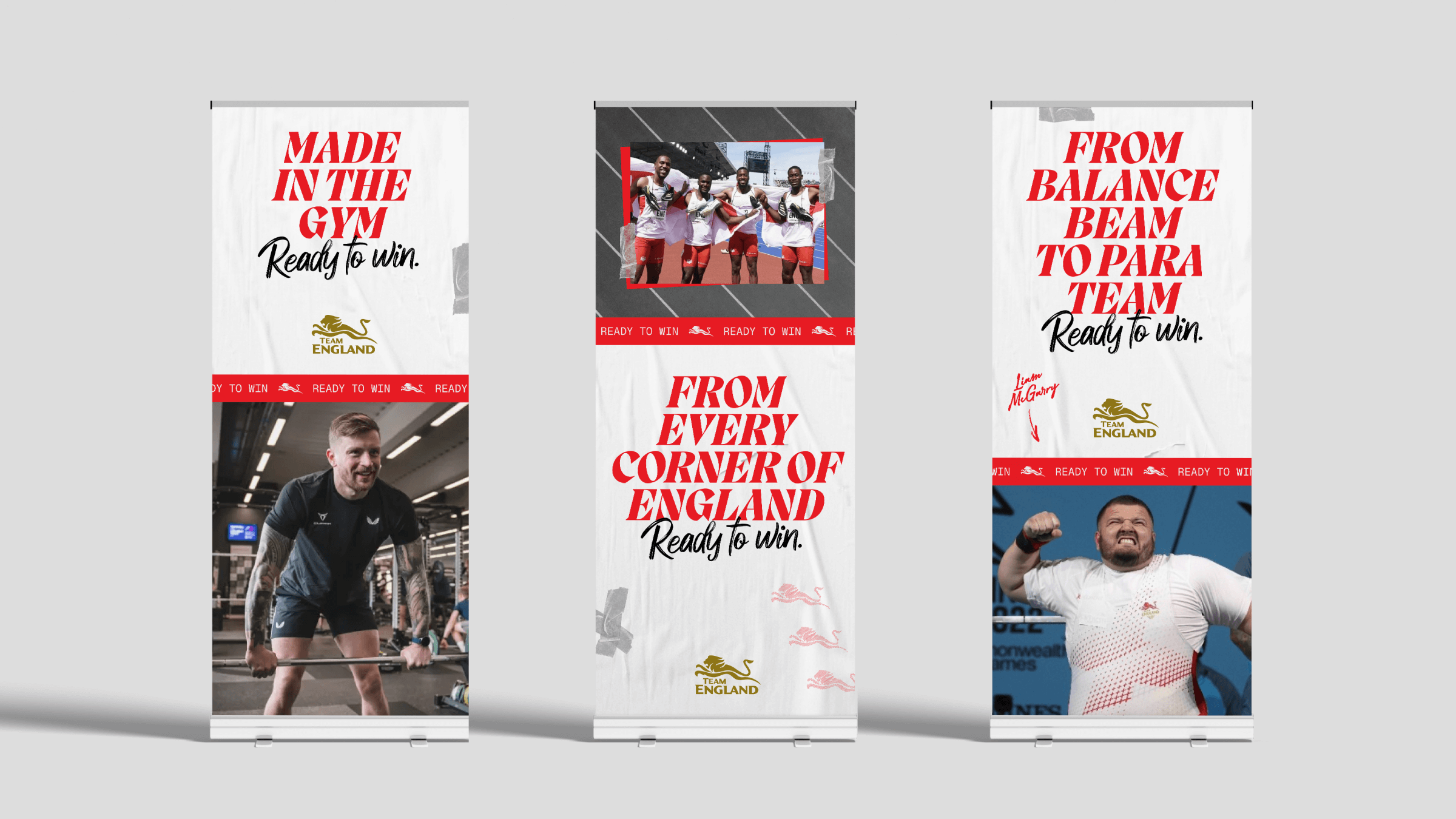
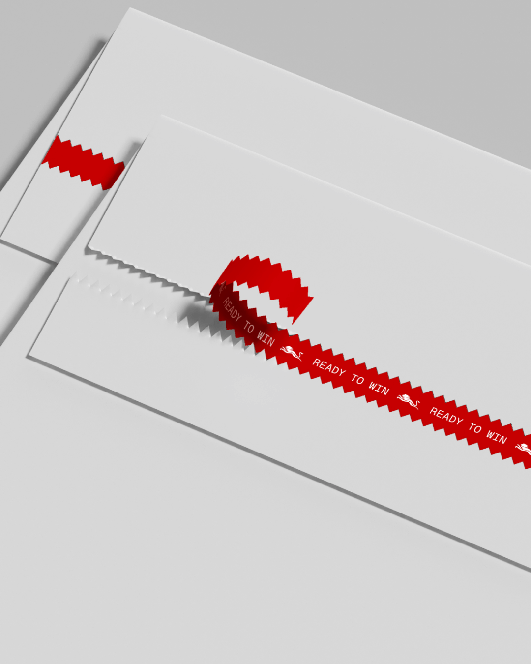
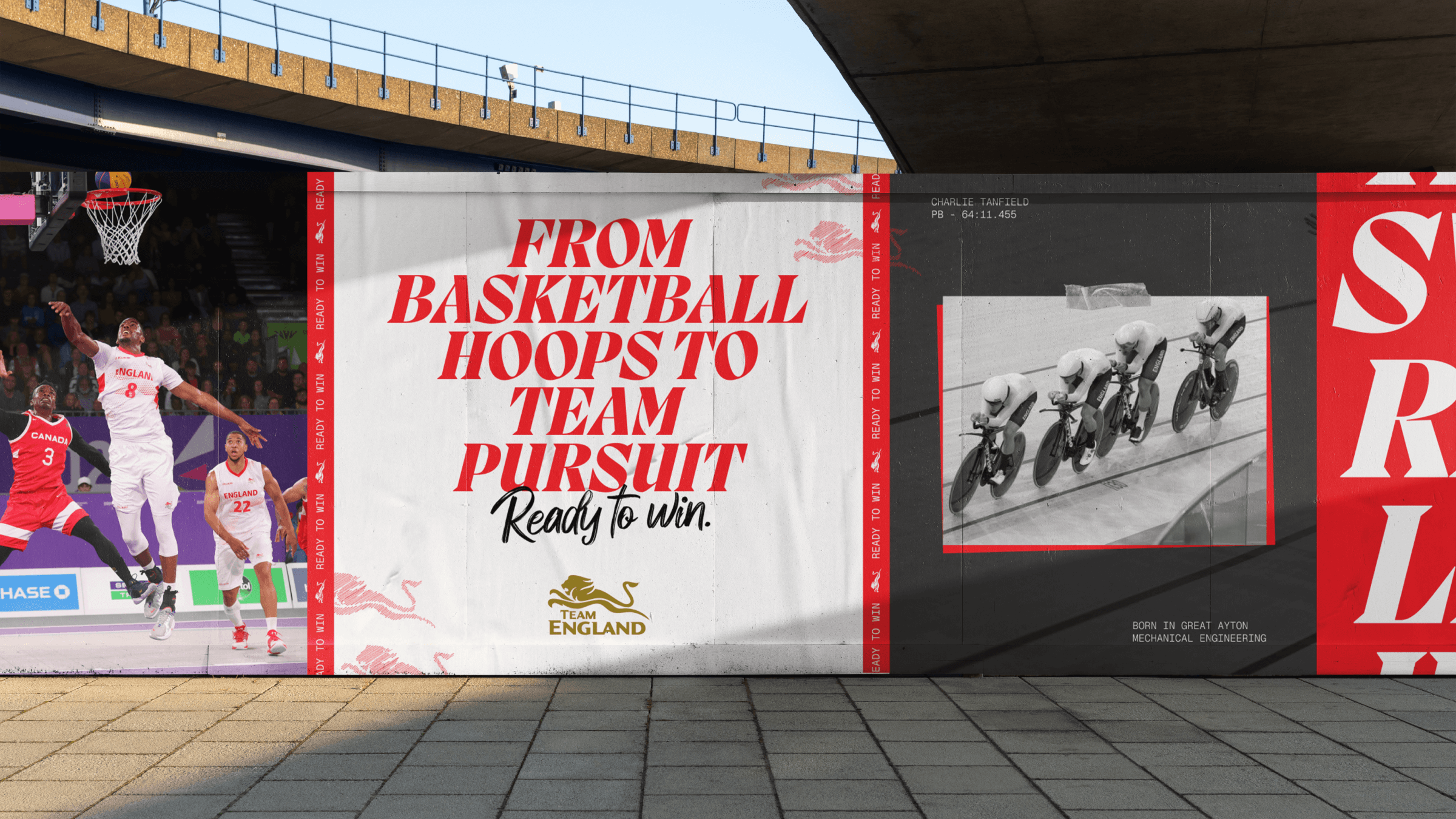
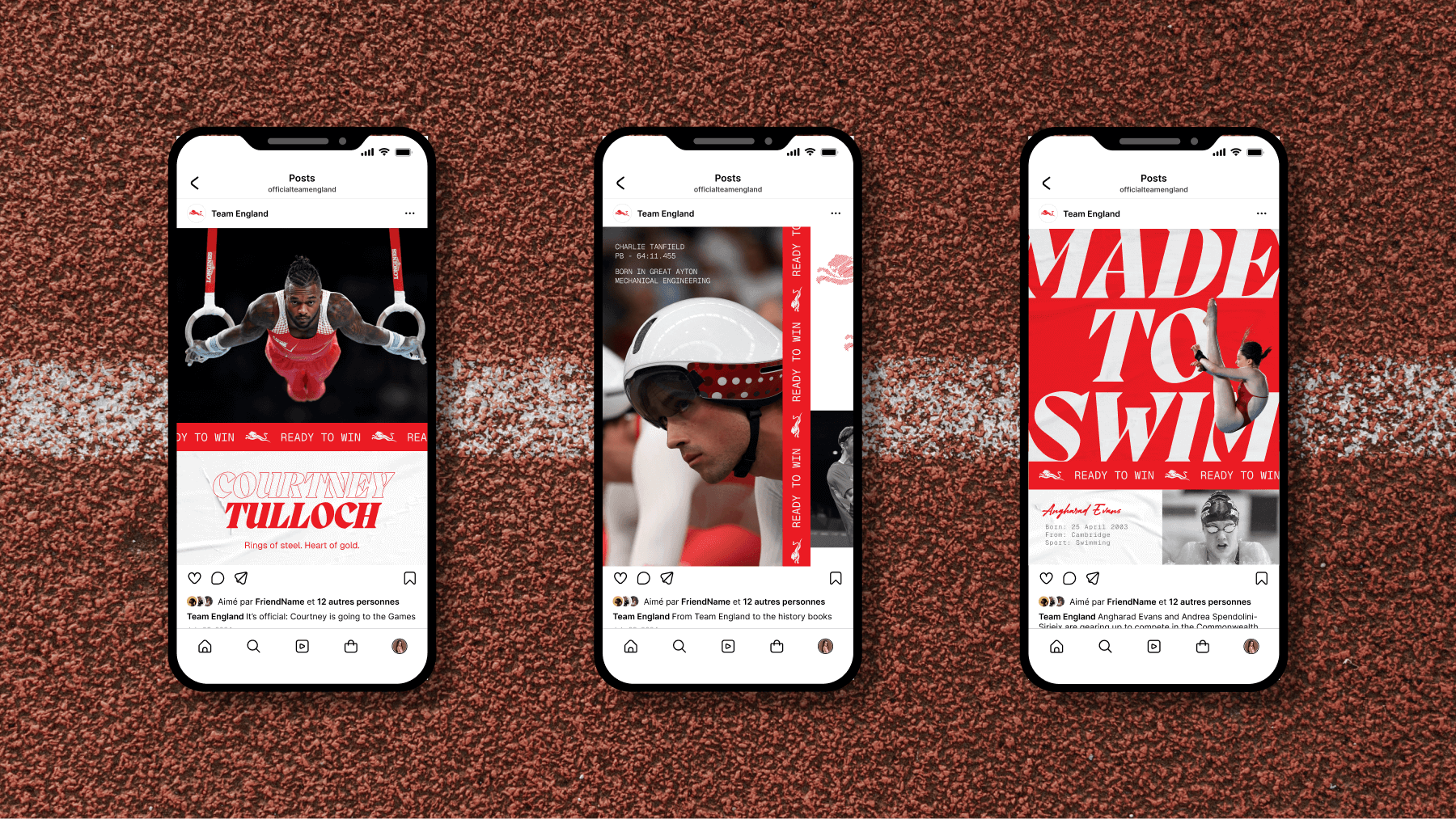
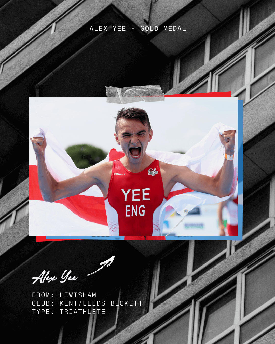
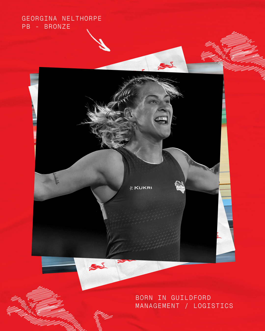
The Ready to Win ticker tape functions as a flexible layout device, used to break up content and create a dynamic grid structure that adds rhythm and energy to every composition. Paper textures nod to the grassroots, scrapbook energy of Team England’s diverse journeys. Scribbles and sticky tape introduce rawness, movement and personality – giving the visuals a sense of energy and lived experience. Combined with dynamic imagery, bold typography and confident white space, the system delivers both order and expression – reflecting the duality of precision and passion in sport.
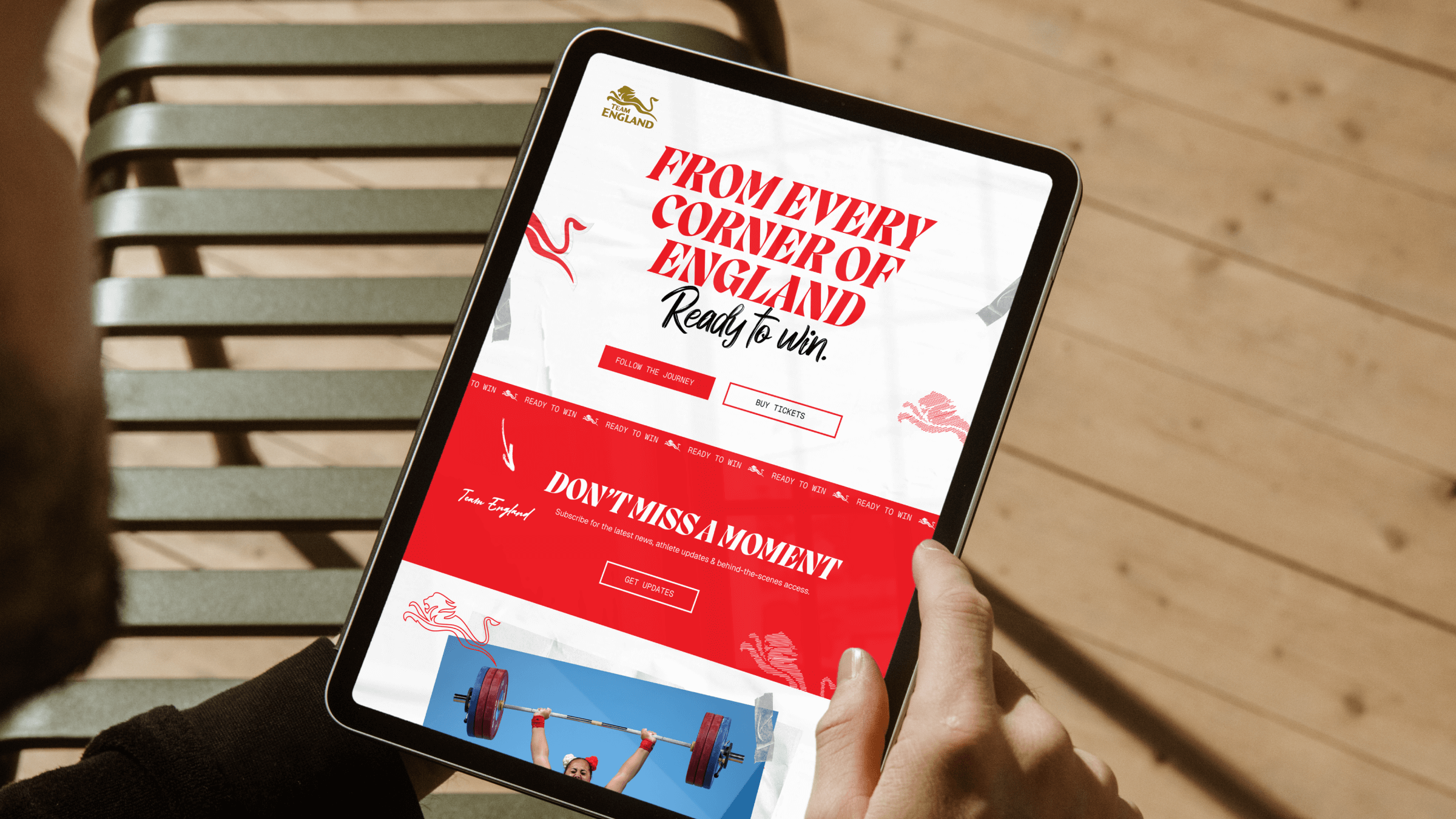
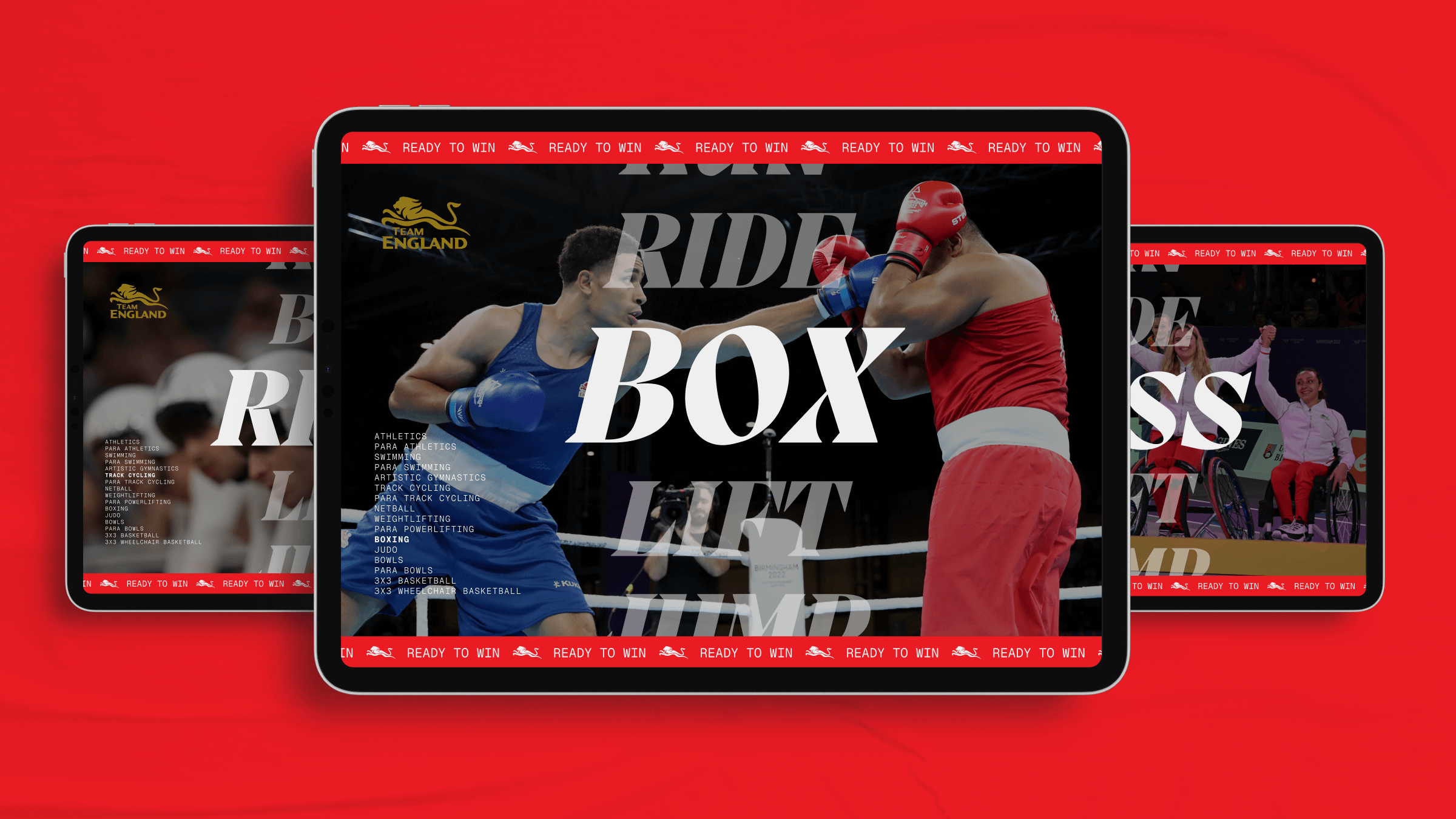
The colour system celebrates English sporting heritage through red, white, gold and black, used with careful balance to create clarity and contrast. White provides space and focus; red delivers energy; gold appears sparingly, like a medal moment; while black adds impact and authority.
The chosen typography plays an equally expressive role. Migra, a modern serif, conveys movement and pride; Geist Mono and Geist Regular ensure clarity and accessibility; while Adelina Camarie, a handwritten script, adds human warmth to quotes and storytelling. Together, they form a confident, modern voice: proud, personal and powerful.

The tone of voice: strong, confident and inclusive, speaks to athletes, fans, partners and media alike. Lines such as “Every step has led you to this moment. Made to run, ready to win.” and “Every stroke has led you to this moment. Made to swim, ready to win.” reflect the athlete’s dedication to sport and team pride. Others embrace sporting and regional diversity: “From arm locks to starting blocks. Ready to win.” and “This one’s for you, Birmingham. Ready to win.”
Photography plays a central role, designed to feel visceral, emotive and proudly English. Cutout imagery spotlights athlete movement and emotion, while place photography captures the full spectrum of England — from city streets to coastal towns, estates to open fields — grounding the brand in everyday authenticity. Textural details like track grit, water shimmer and leather grain add tactile energy, connecting audiences to the physical, human side of sport. The result is a visual identity that’s as much about people and place as it is about performance.