Circular Institute Economy
Circluar Thinking
About the project
What
Brand immersion
Brand strategy
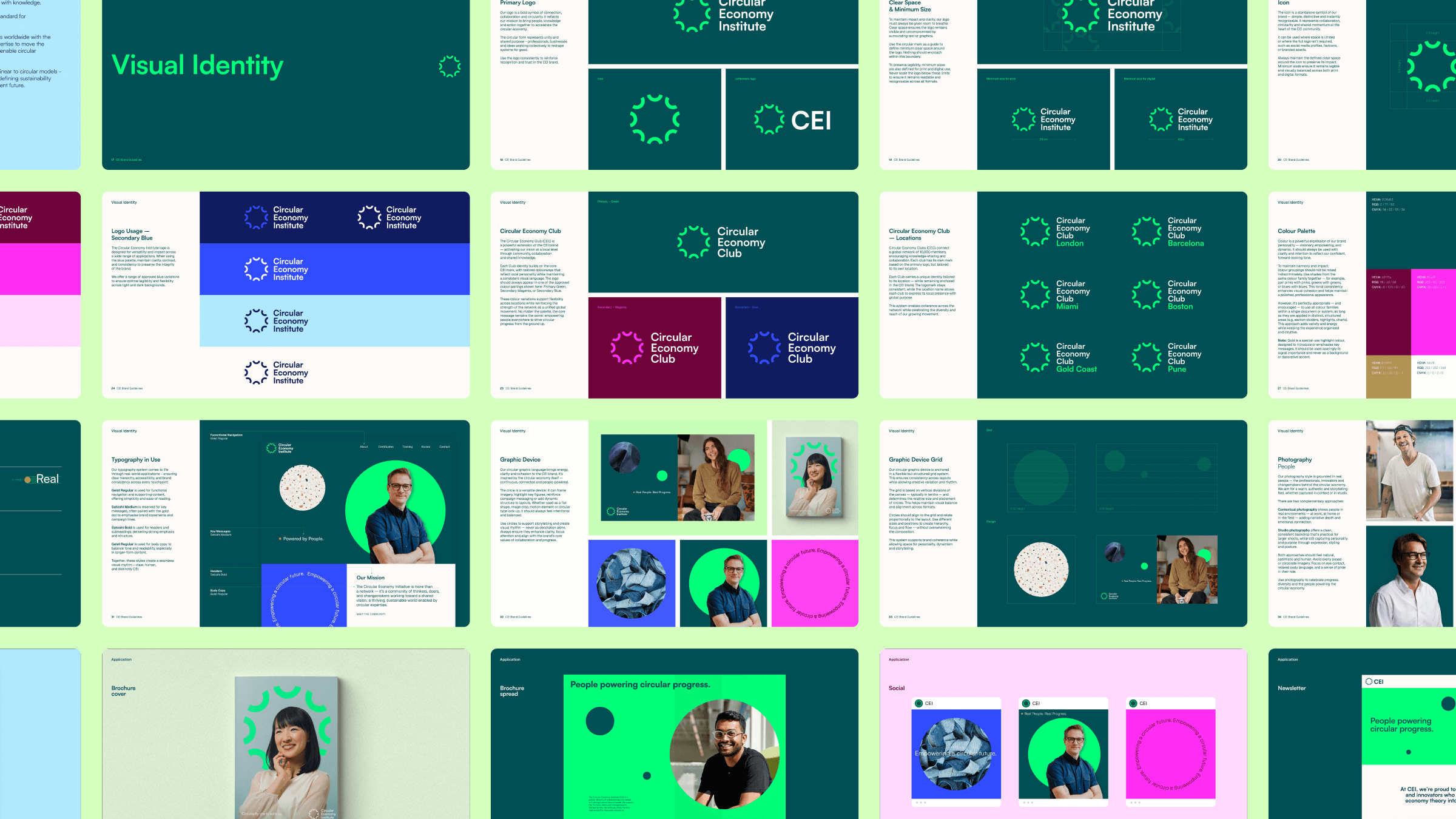
Brand identity
Brand guidelines
Brand implementation
How
Brand idea - Circular Thinking
The Challenge:
The Circular Economy Institute (CEI) needed a new brand to encapsulate its mission to inspire and empower professionals worldwide to turn circular economy principles into best practice through collaboration, training and accreditation.
The challenge was to find the balance between professional credibility and creative energy.
The CEI speaks to a highly professional audience, but one full of innovators and free thinkers. The design system needed to feel clear and authoritative without becoming too corporate or cold.
The Solution:
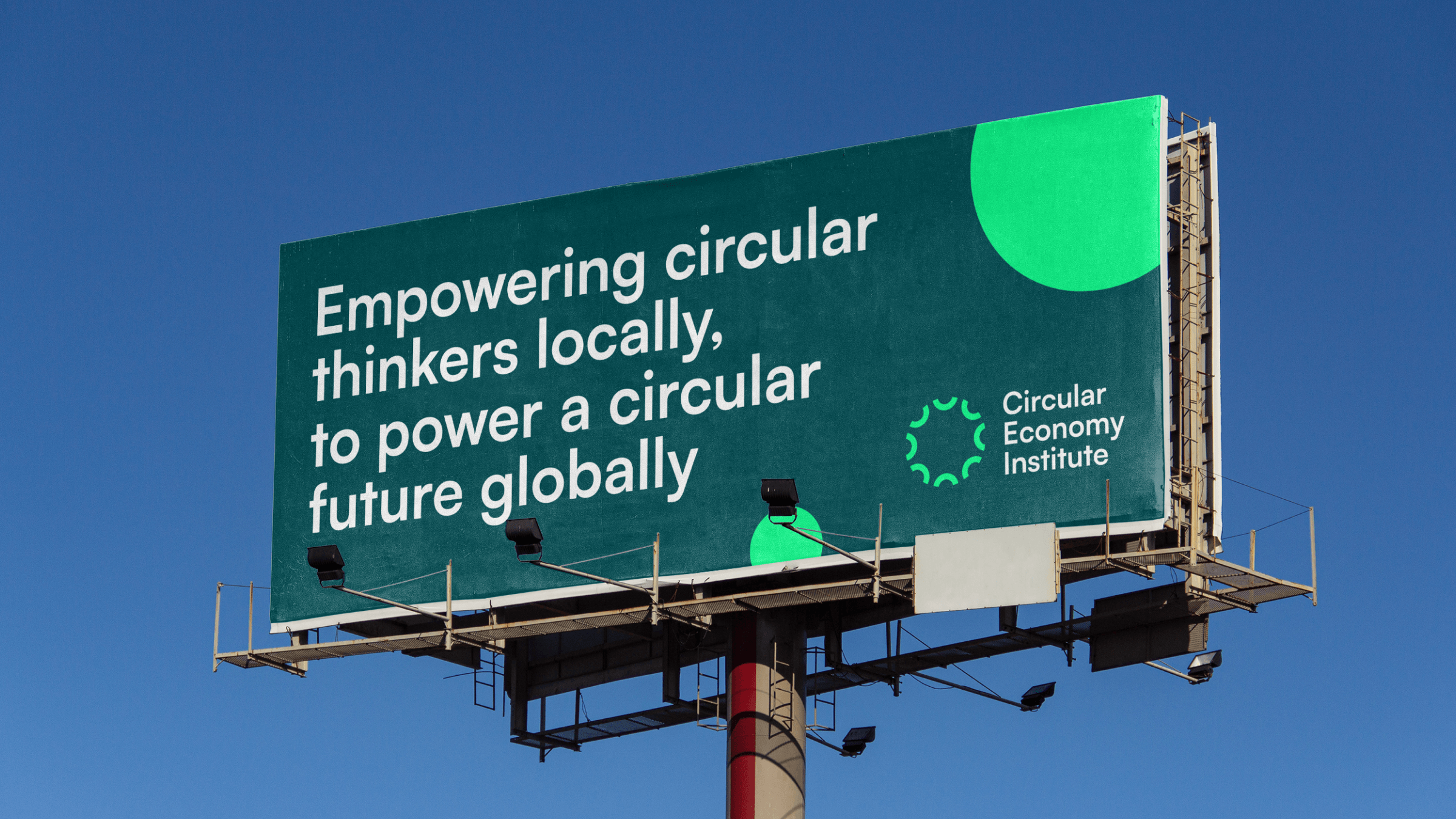
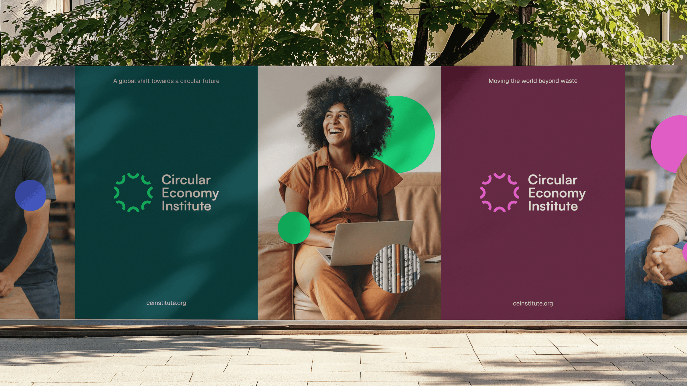
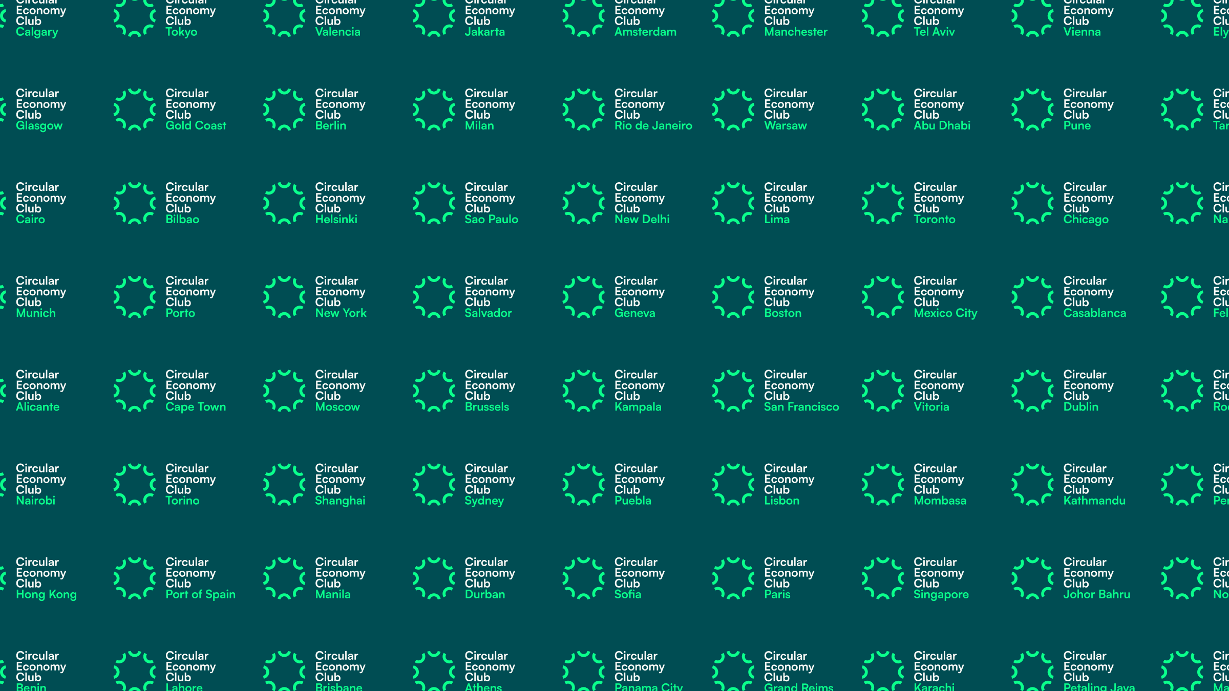
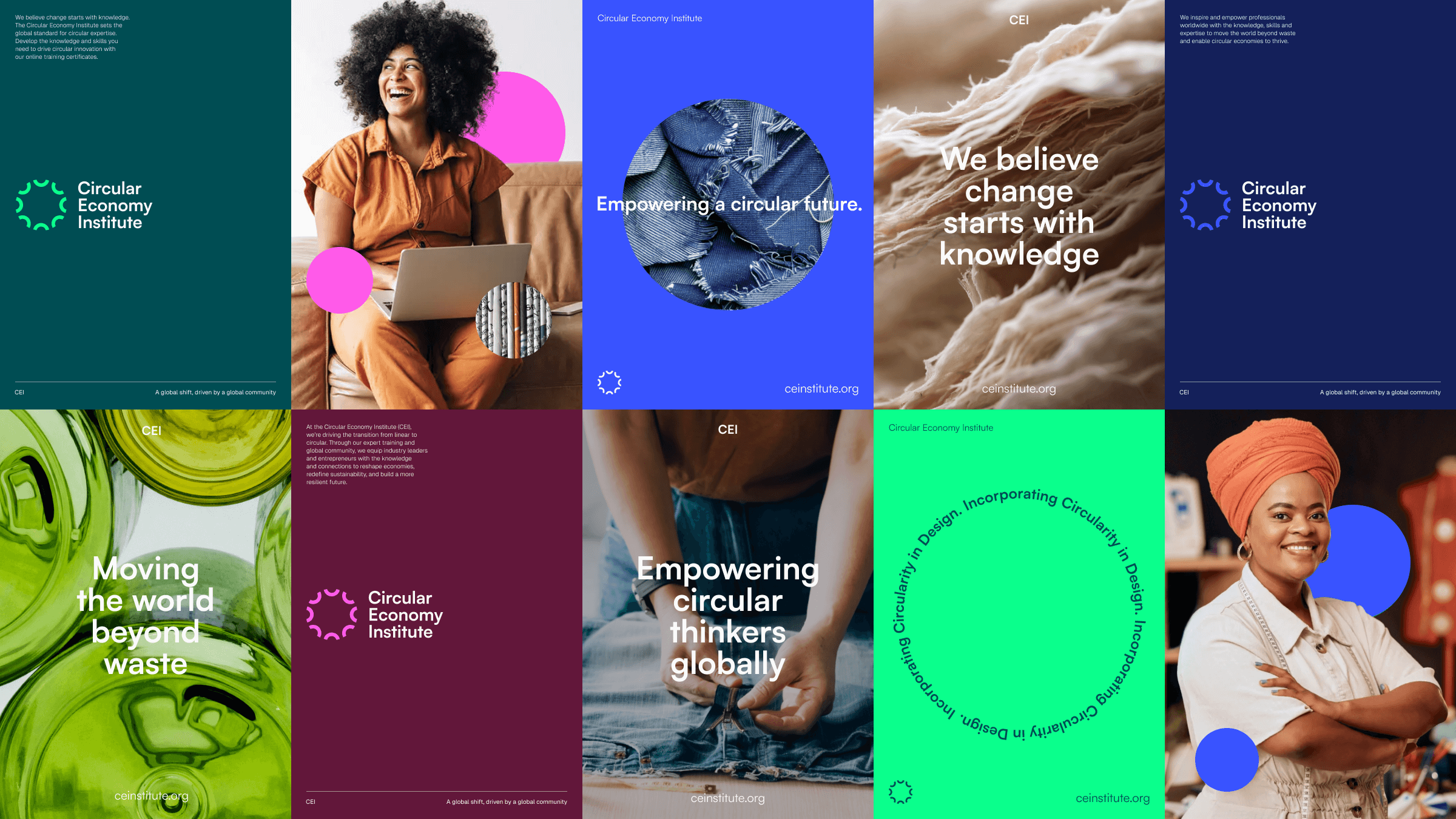
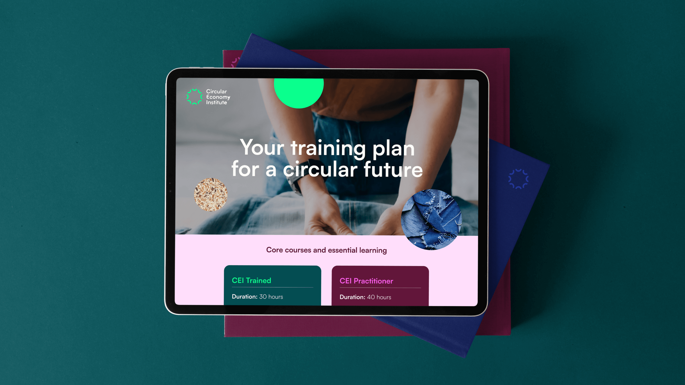
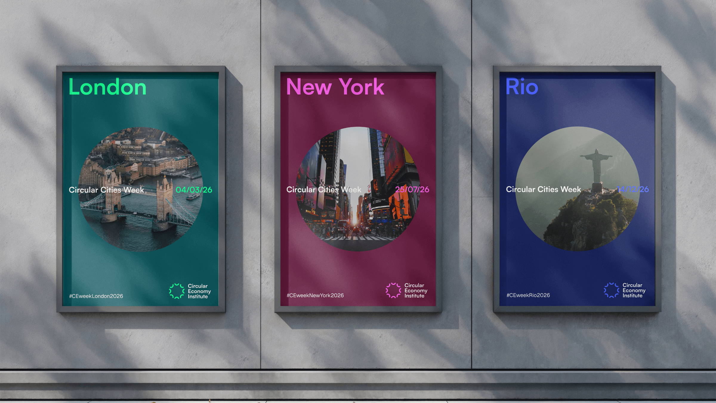
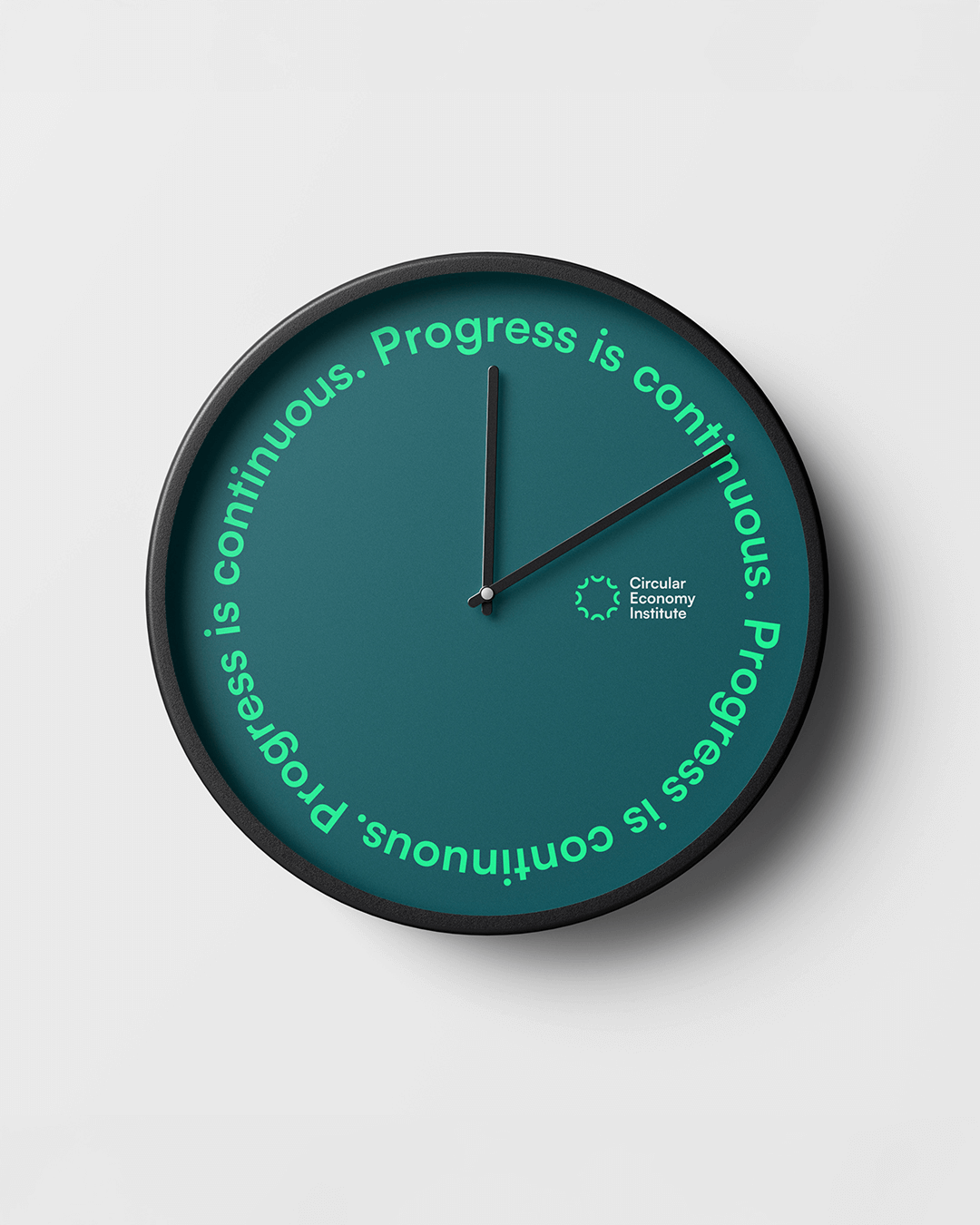
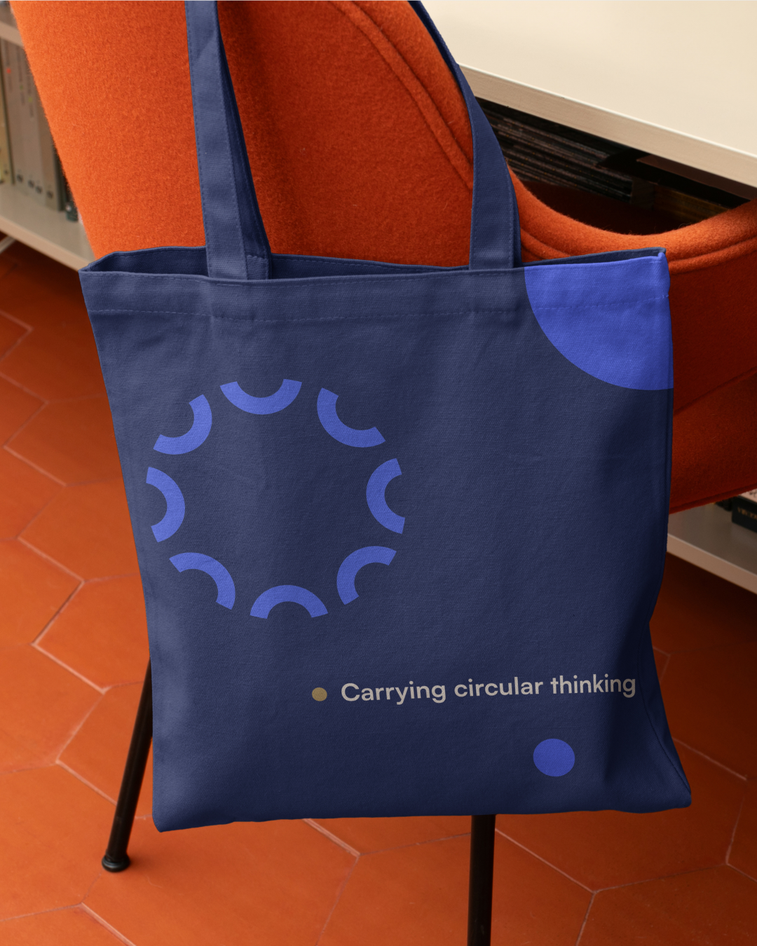
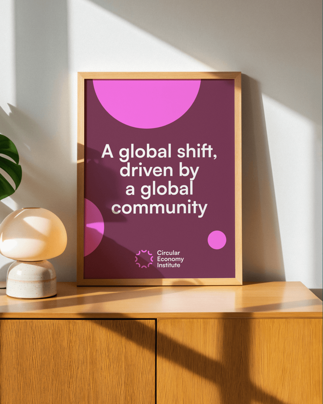
The visual identity is built around a circular form derived from the letter C, referencing circularity, community, collaboration and CEI itself. This form acts as a flexible building block that adapts, repeats and connects across designs.
Rather than relying on overt eco cues or defaulting to natural greens and browns, the identity uses colours that feel vibrant, contemporary and forward-looking.
Typography plays a central role in giving CEI a distinctive and consistent voice. Satoshi, a modernist sans serif inspired by industrial-era typography, reflects the organisation’s connection to industry and progress.
The result is a flexible design system that can scale globally, support localised applications and bring consistency to everything from training materials and accreditation certificates to digital platforms and event environments.
The new identity is now live across CEI’s website, education programmes, accreditation certificates and global communications.
In Partnership with Barley Communication