London's Air Ambulance Charity
Propelling Promise
About the project
What
Brand immersion
Brand strategy
Tone of Voice
Copywriting
Brand identity
Brand guidelines
Brand implementation
How
Brand idea - Propelling Promise
The Challenge:
With a rising number of patients across London every year, London’s Air Ambulance Charity needs to raise £17million a year to deliver its service.
Following a new organisational strategy, the charity saw a need to evolve its brand identity to raise awareness and strengthen its connection with London’s communities to enhance fundraising efforts.
The refreshed brand needed to lean on the organisation’s bold history while looking to the future - updating its visual and verbal identity to help the charity achieve its ambitious goals.
The Solution:
To land the brand strategy, we worked with LAAC's in-house team to ask Londoners how they would sum up the service: ‘Amazing’, ‘Essential’, and ‘Life-saving’ came out on top.
Our team also spent time with the operational crew and took inspiration from the urgent, intense nature of their work, before crafting the brand idea Propelling Promise - a platform that drives the entire visual and verbal identity.
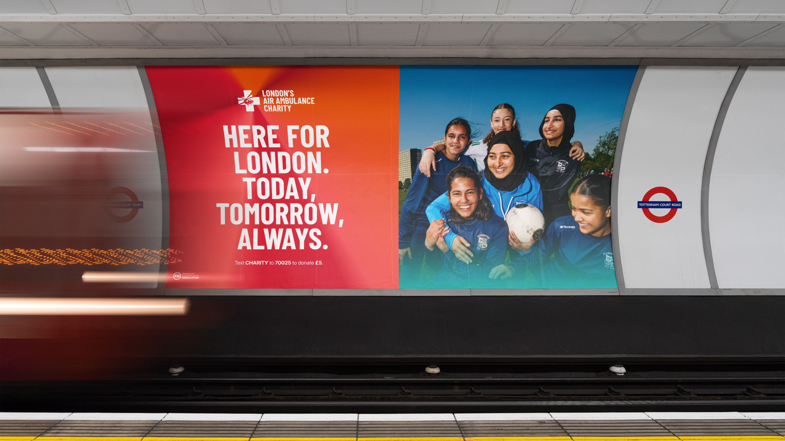
To bring Propelling Promise to life, the visual identity is built around a unique gradient design which draws on the rotational motion of helicopter blades. While red remains central to the charity’s identity, we brought in the vivid orange worn by medics on-scene. The logo has been updated with a new wordmark inspired by the lettering on the helicopter tail. Subtle motion reflects the aircraft’s blades in flight.


Typography plays a key role in expressing London locality, with borough names like Hackney repeated in radiating patterns and overlaid with the gradient. Accessibility was fundamental: the full palette meets AA standards for legibility and inclusivity.
We used the brand idea of Propelling Promise to give structure to creative copy lines and the new tone of voice. Lead lines held an element of both “propelling” (urgency, momentum) and an element of “promise” (warmth, hope). Lead lines like “Trauma doesn’t stop. Neither do we” and “Here for London. Today, tomorrow, always”.


New icons, motion, memorabilia badges inspired by crew uniforms and photography connecting the charity to the communities it serves completed the brand evolution.
Now, Propelling Promise has taken flight - teams across the organisation feel aligned to the sentiment of being a brand about action, a driving force, as well as compassion and hope, mixing the rich spirit of the organisation's heritage with the forward-looking nature of the new strategy and brand.


