
British Cycling
National Series and Championships
About the project

What
Campaign idea
Campaign identity
Campaign guidance
Brand idea
This is where legends are made
The Challenge:
British Cycling came to us because they wanted to give their National Series and National Championships a proper step up.
These are the big domestic events: the races where the country’s best riders turn up across road, track, BMX, mountain bike - the lot, and go for it. It is where younger riders get the chance to make their name alongside established talent. So it needed to feel important. It needed to feel like the pinnacle.
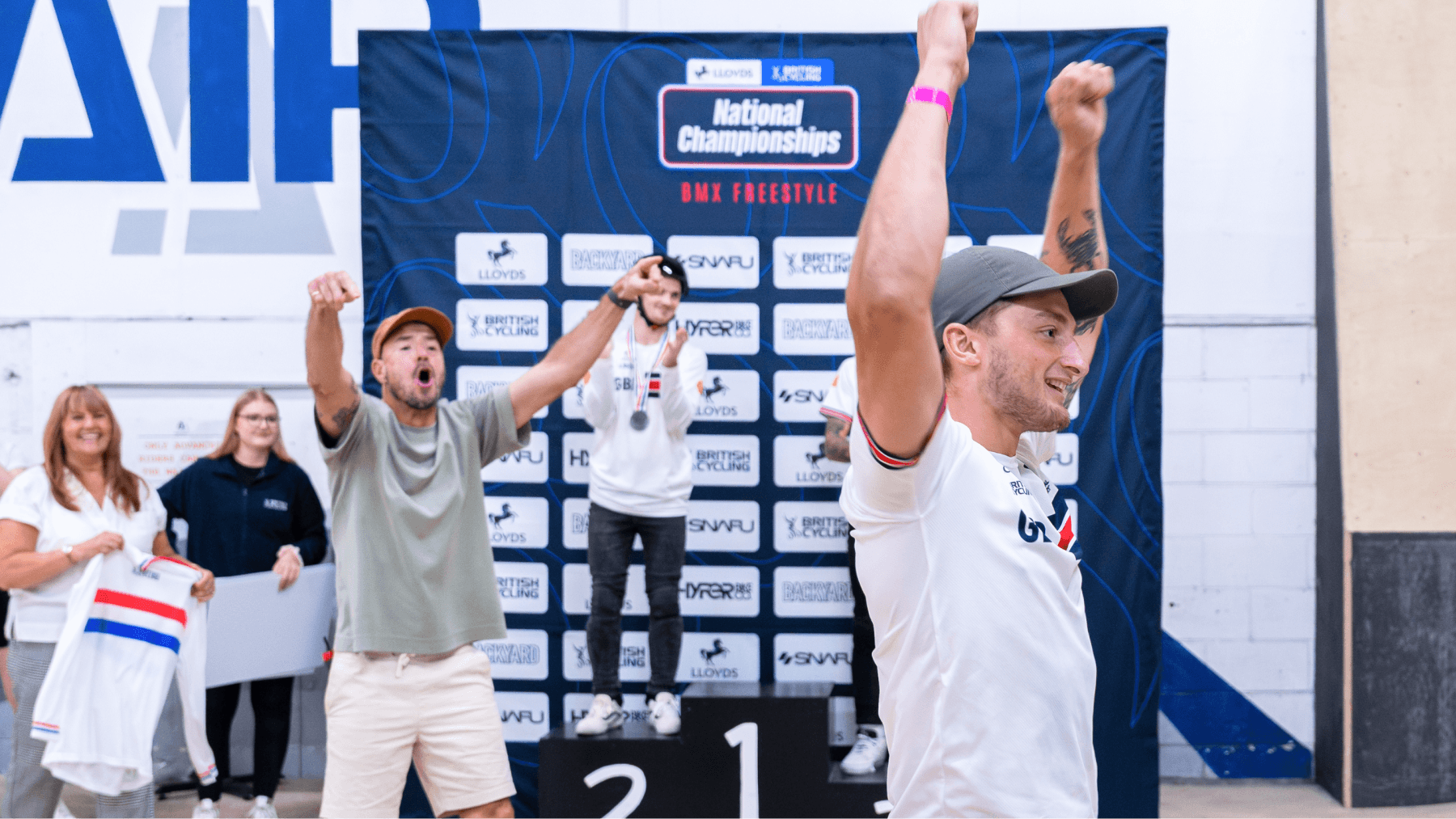
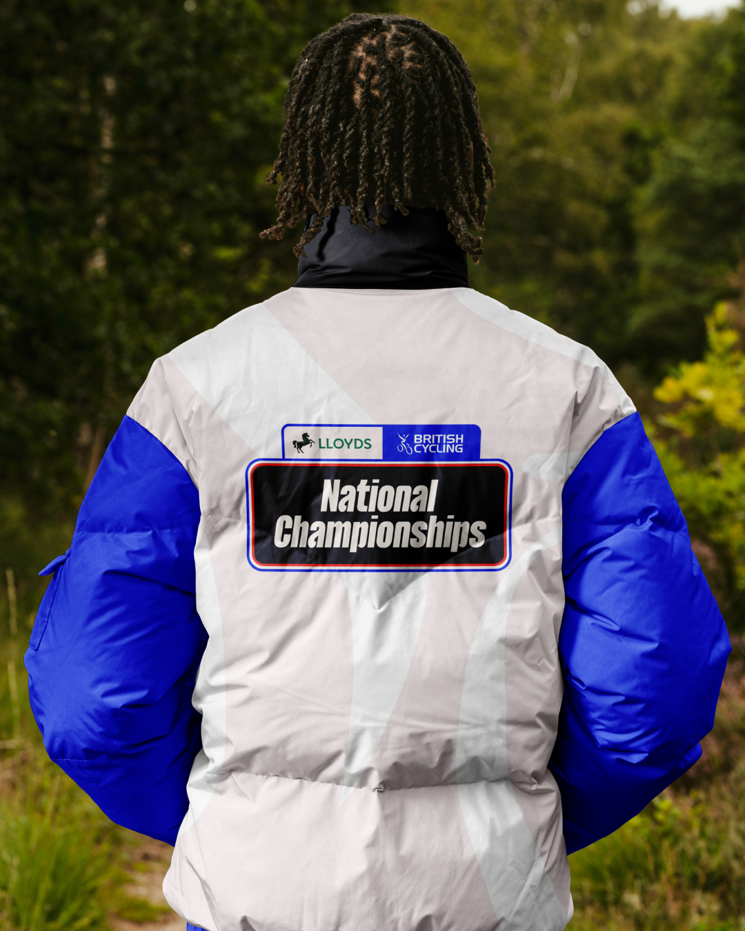
The tricky bit was making that work everywhere. Different disciplines, different venues, signage, social, kit, event graphics, it all had to feel like one joined-up family. And because Lloyds is the headline partner, we also needed to give Lloyds and British Cycling equal weight without it becoming a clunky sponsor lock-up.
The Solution:
The whole thing started with one thought:
This is where legends are made.
These races are not just another fixture in the calendar. They are the proving ground: the place where riders push themselves, make split-second decisions and find out what they are made of. One moment can change a race, and one race can change a career.
That gave us the vibe. It needed to be fun and full of energy, but still have that sense of ambition and prestige. We looked at the visual world of cycling more widely, the speed, attitude and confidence you see across different bike categories, then built something that could feel exciting and relevant wherever it showed up.
The Output:
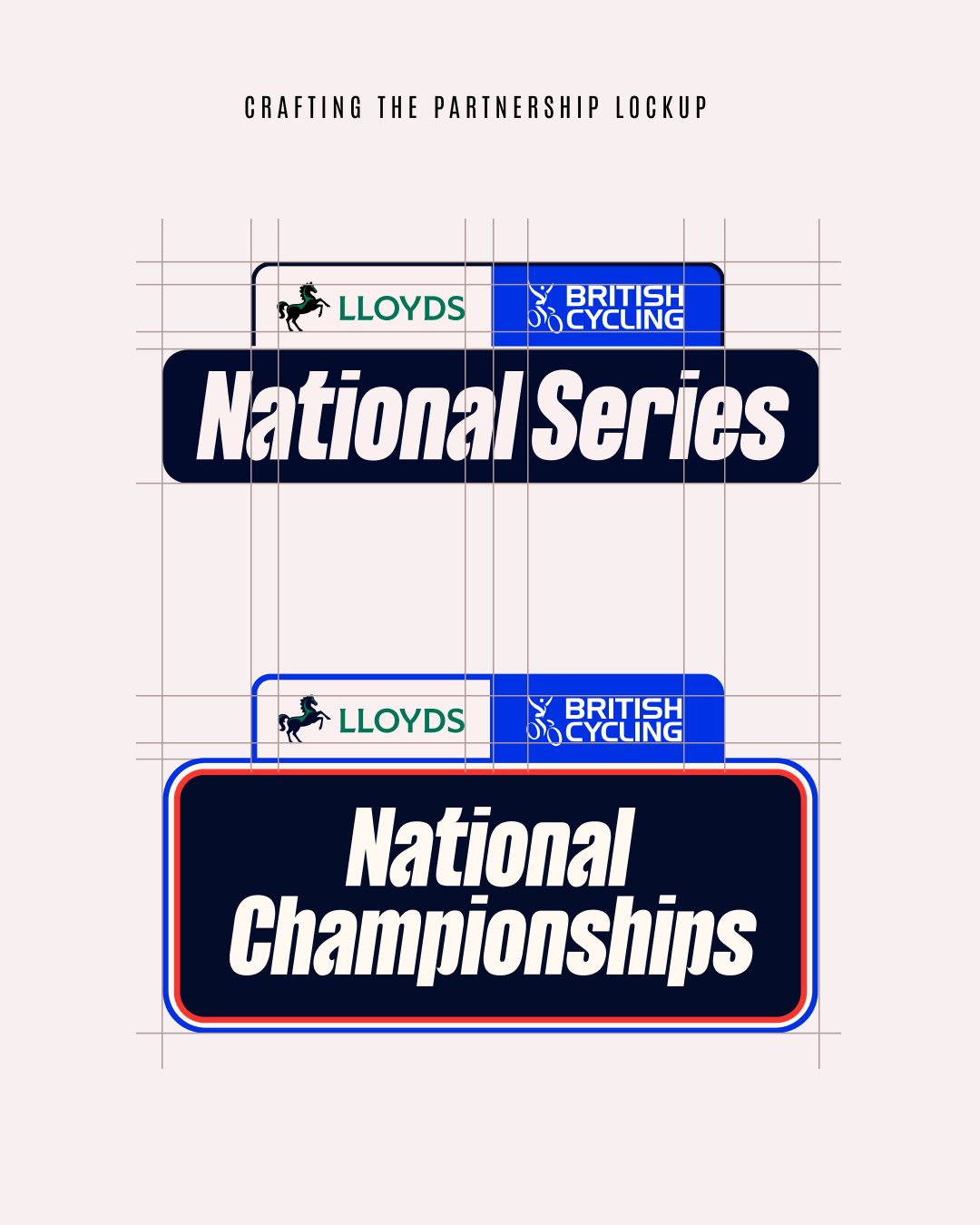
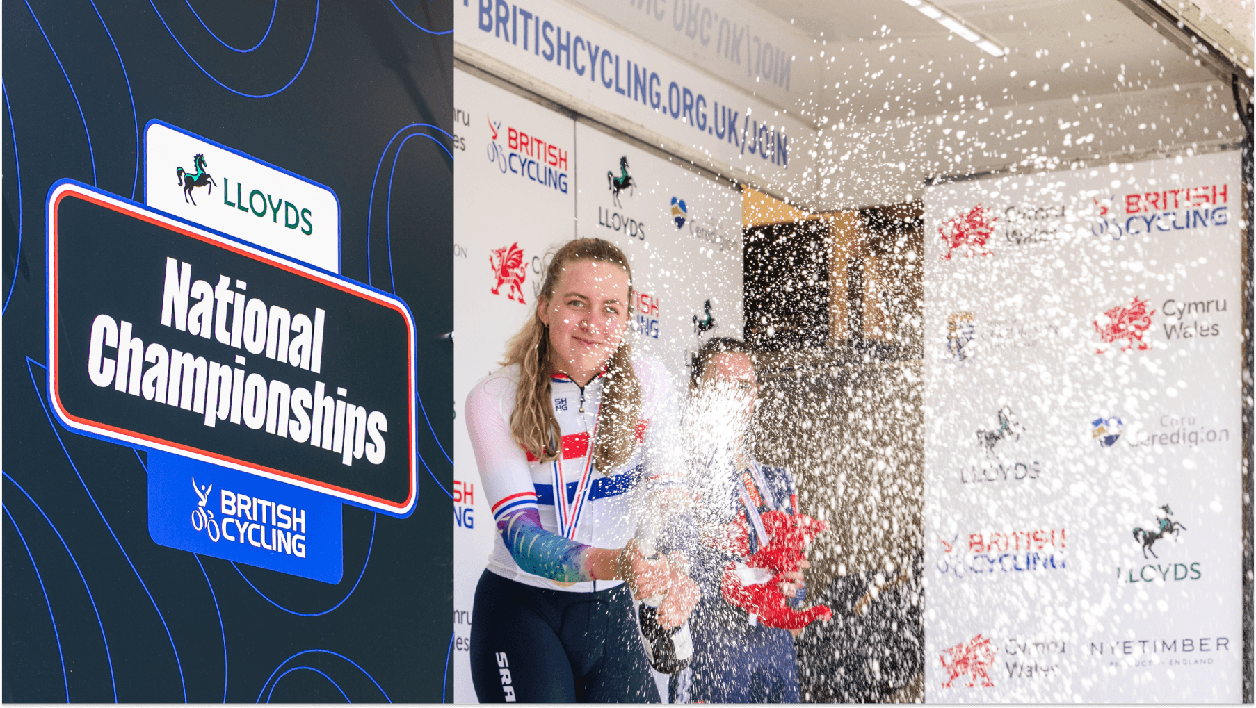
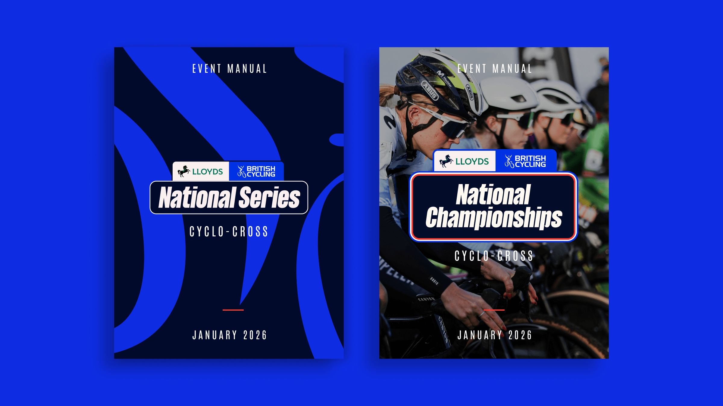
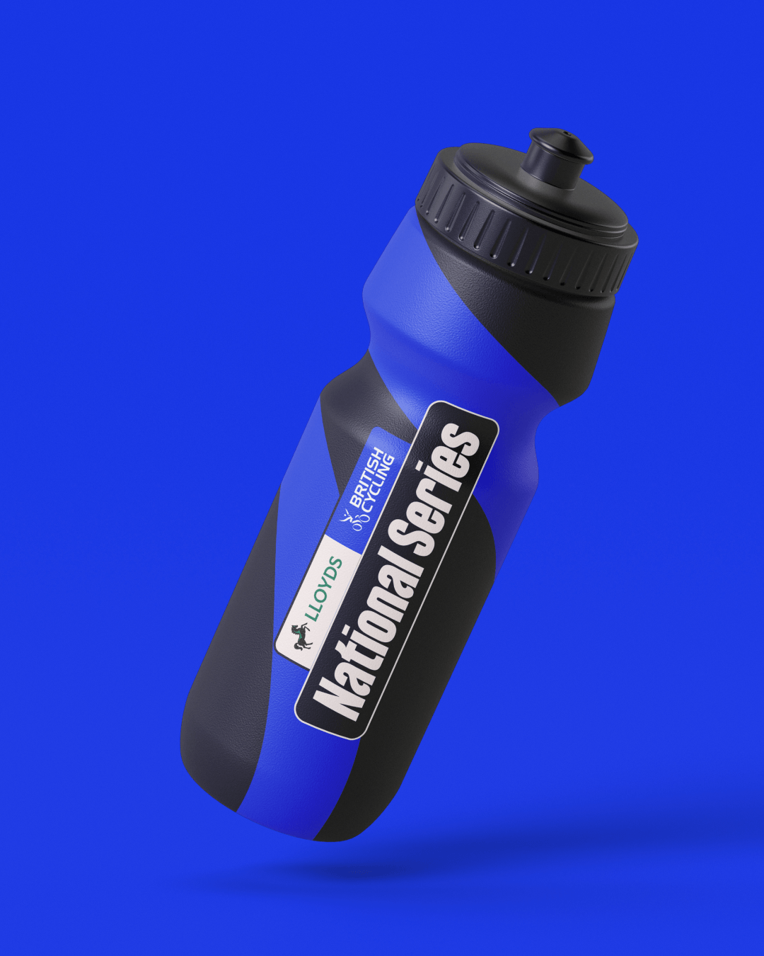
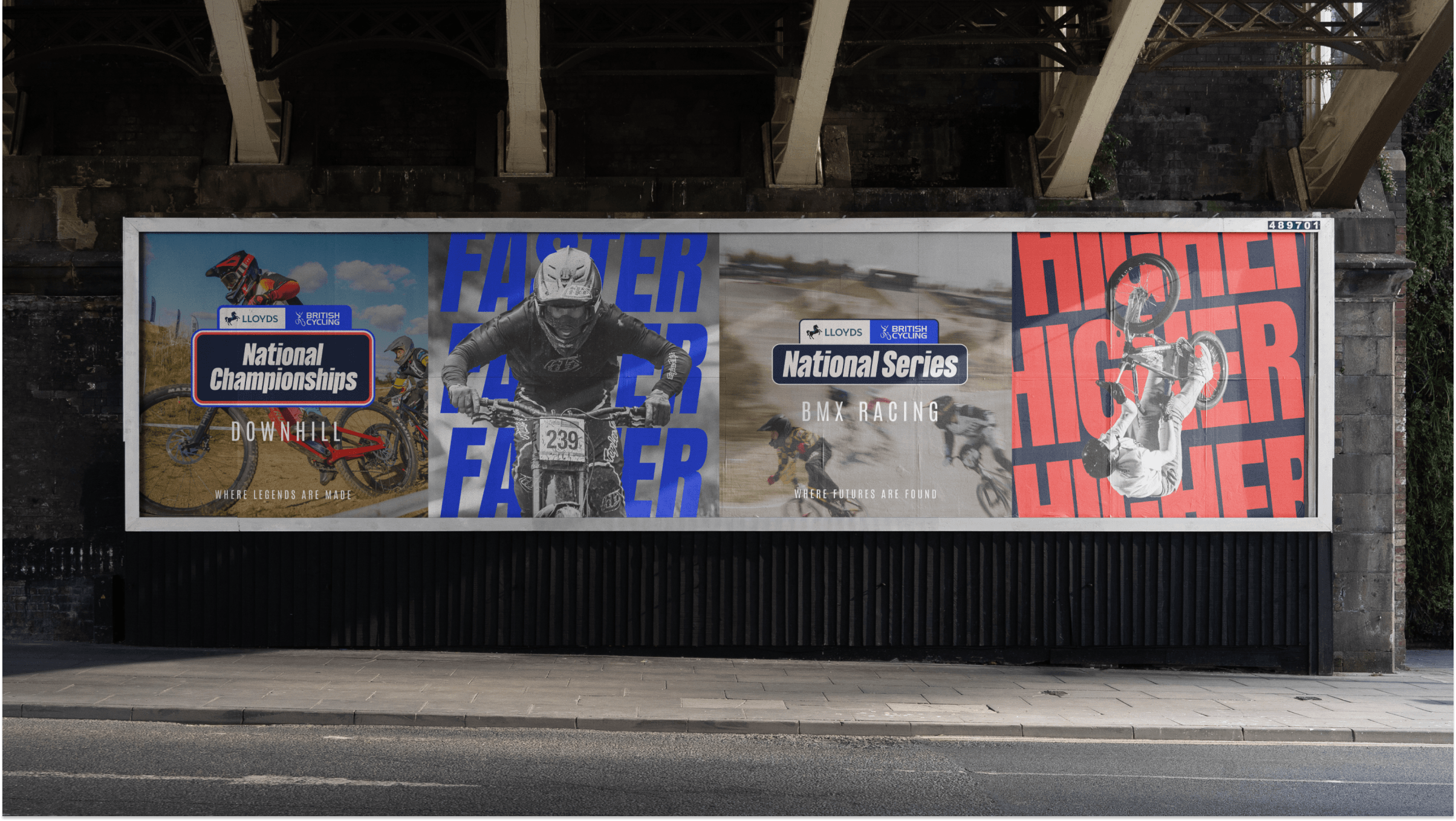
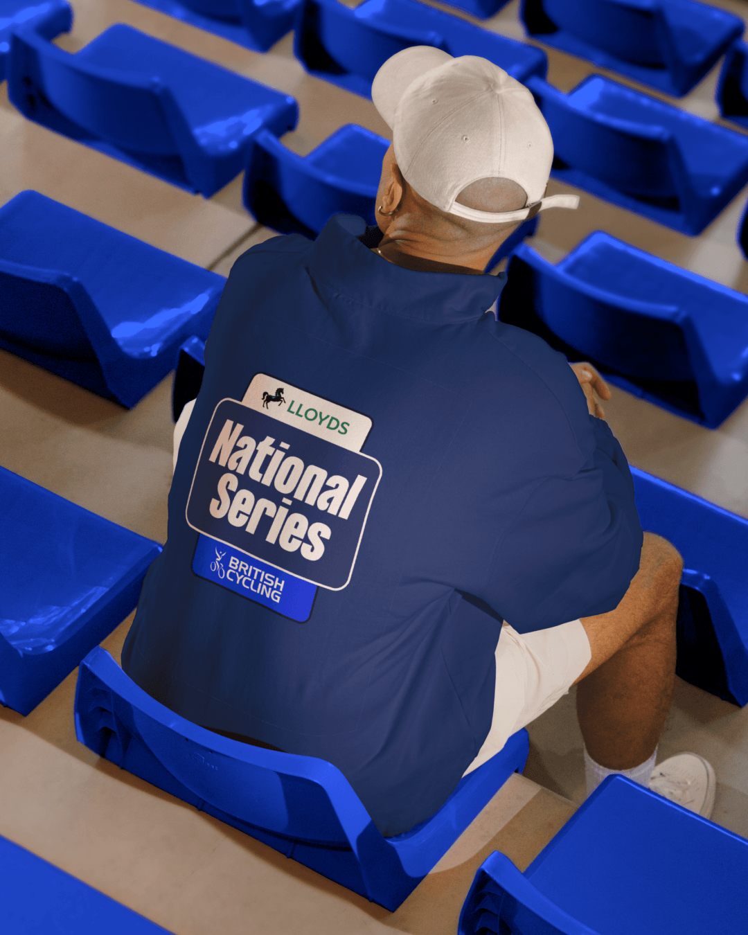
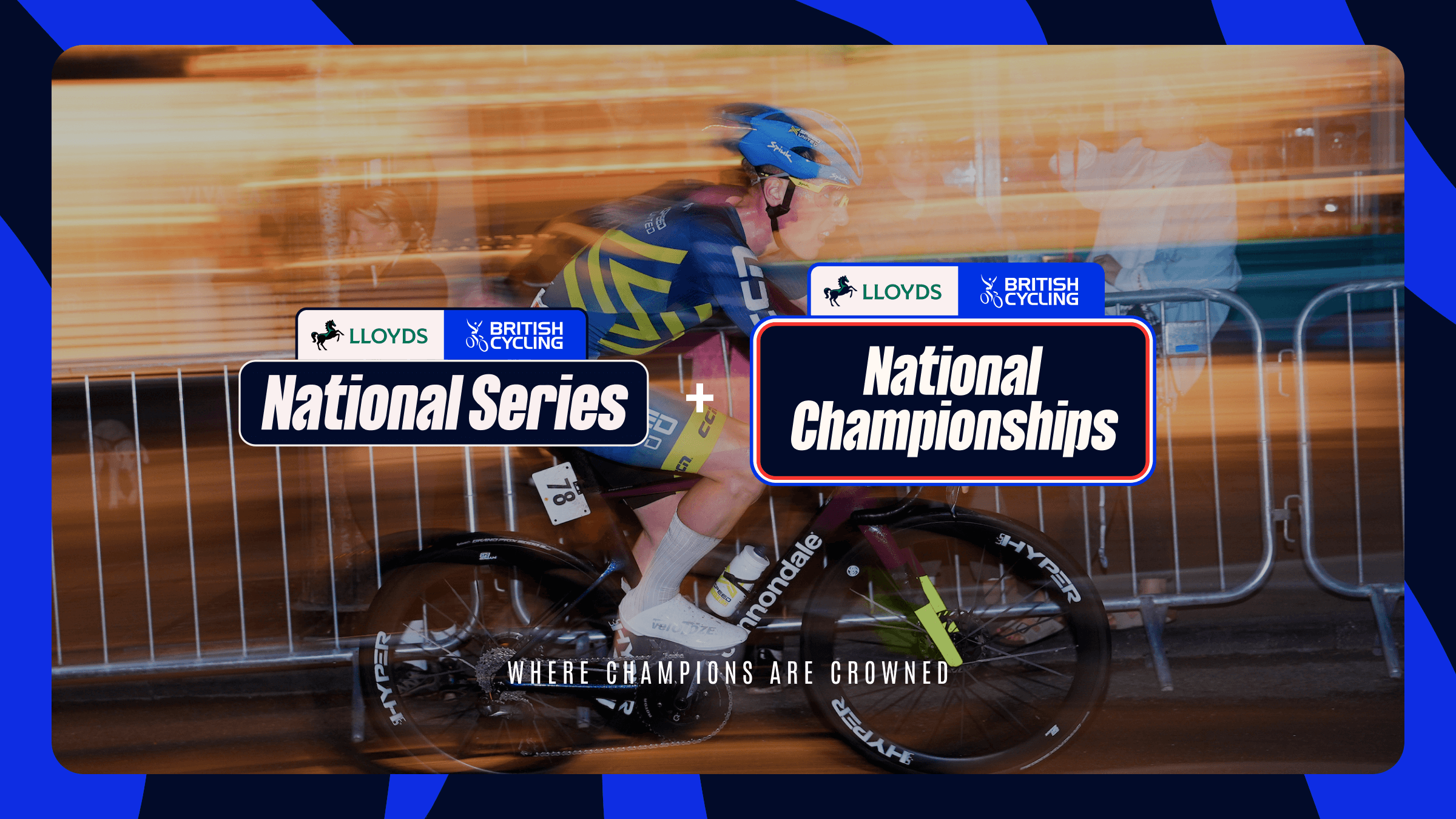
We created two distinct but connected identities for the National Series and National Championships, giving British Cycling and Lloyds a strong, balanced presence.
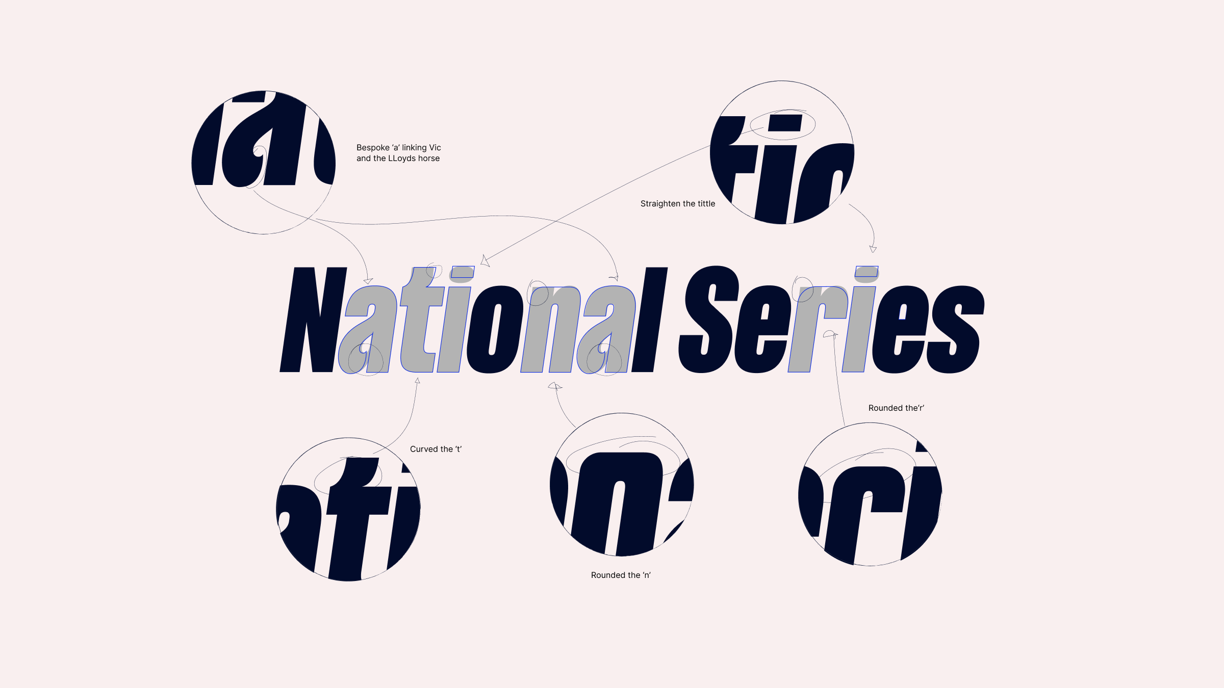
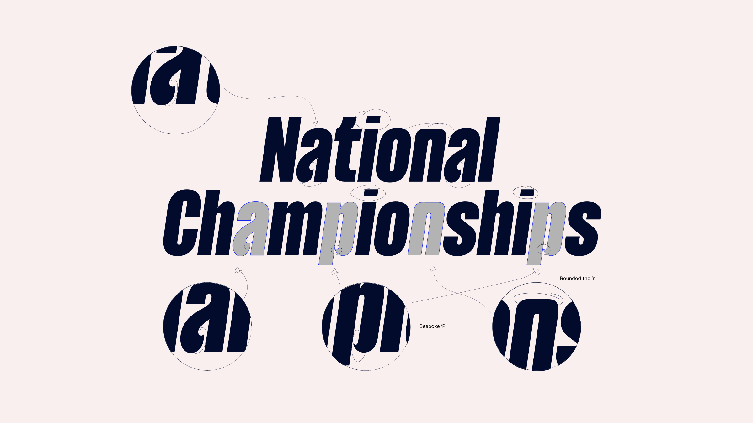
The type was a big part of it. We started with Anton, which is already part of the British Cycling brand, but we did not just use it straight from the box. We crafted and adjusted selected letters to make it feel more distinctive and ownable.
The new shapes take influence from Vic, the British Cycling symbol, as well as the curves and movement of the Lloyds horse. So even in the typography, there is a subtle connection between the two brands. It feels more athletic, more energetic and much more like it belongs to these events.
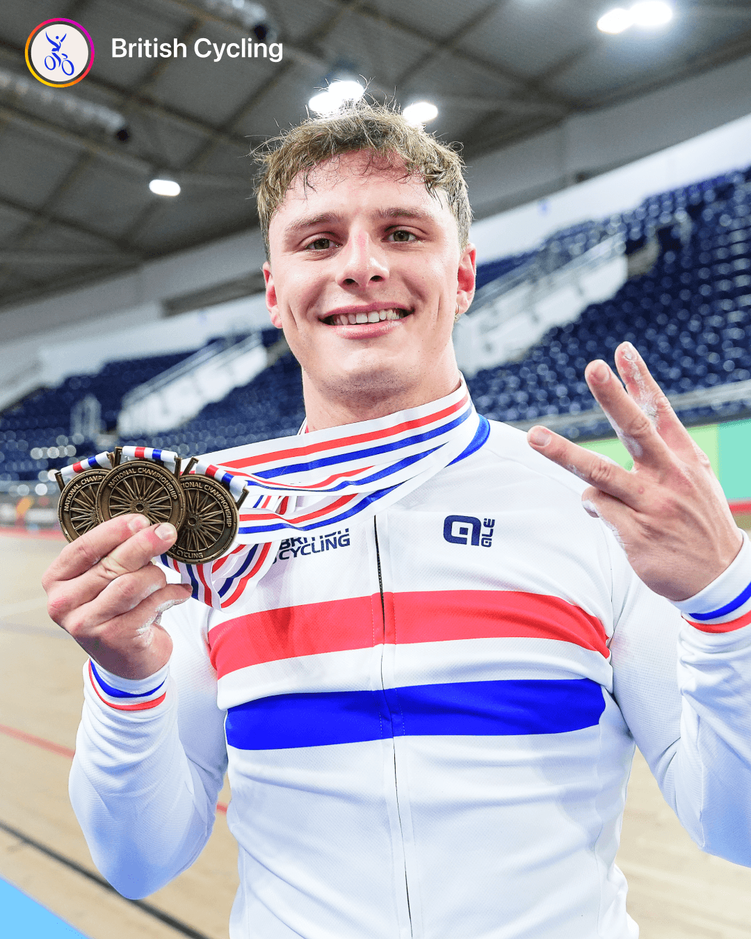
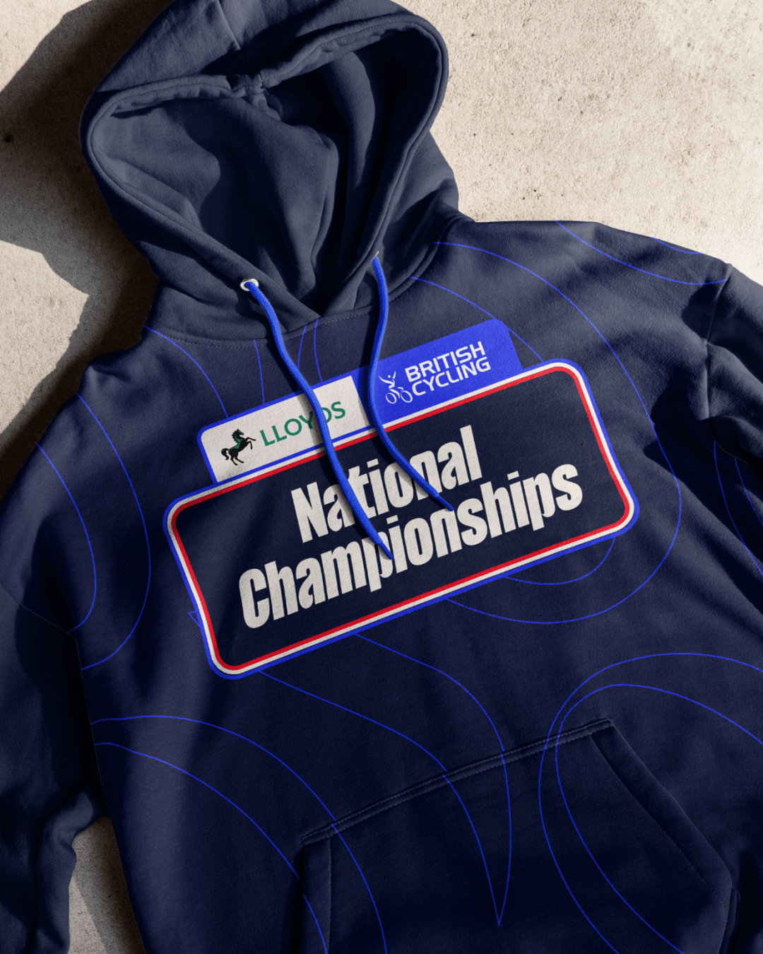
For the Championships, we leaned into red, white and blue, the colours of the champion’s jersey. It is an immediate nod to championship pride, but used in a fresher, more contemporary way: bold, bright and unapologetically competitive.
We also created a flexible graphic device using Vic. It can be used as a solid shape or as an outline, depending on what the application needs. Sometimes it sits in the background and adds texture; sometimes it becomes the hero.
That flexibility was important because the system has to work across so many events without becoming repetitive.
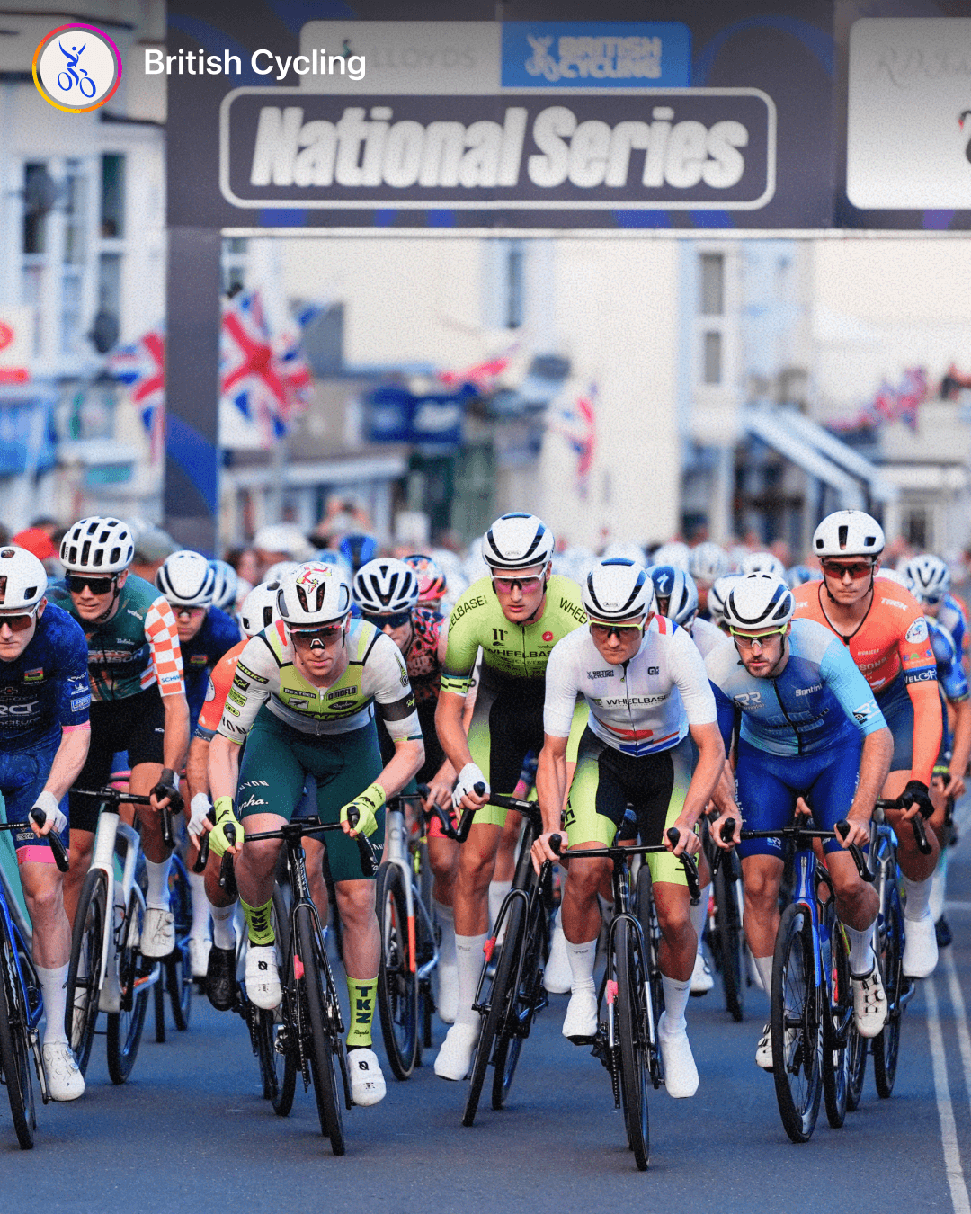
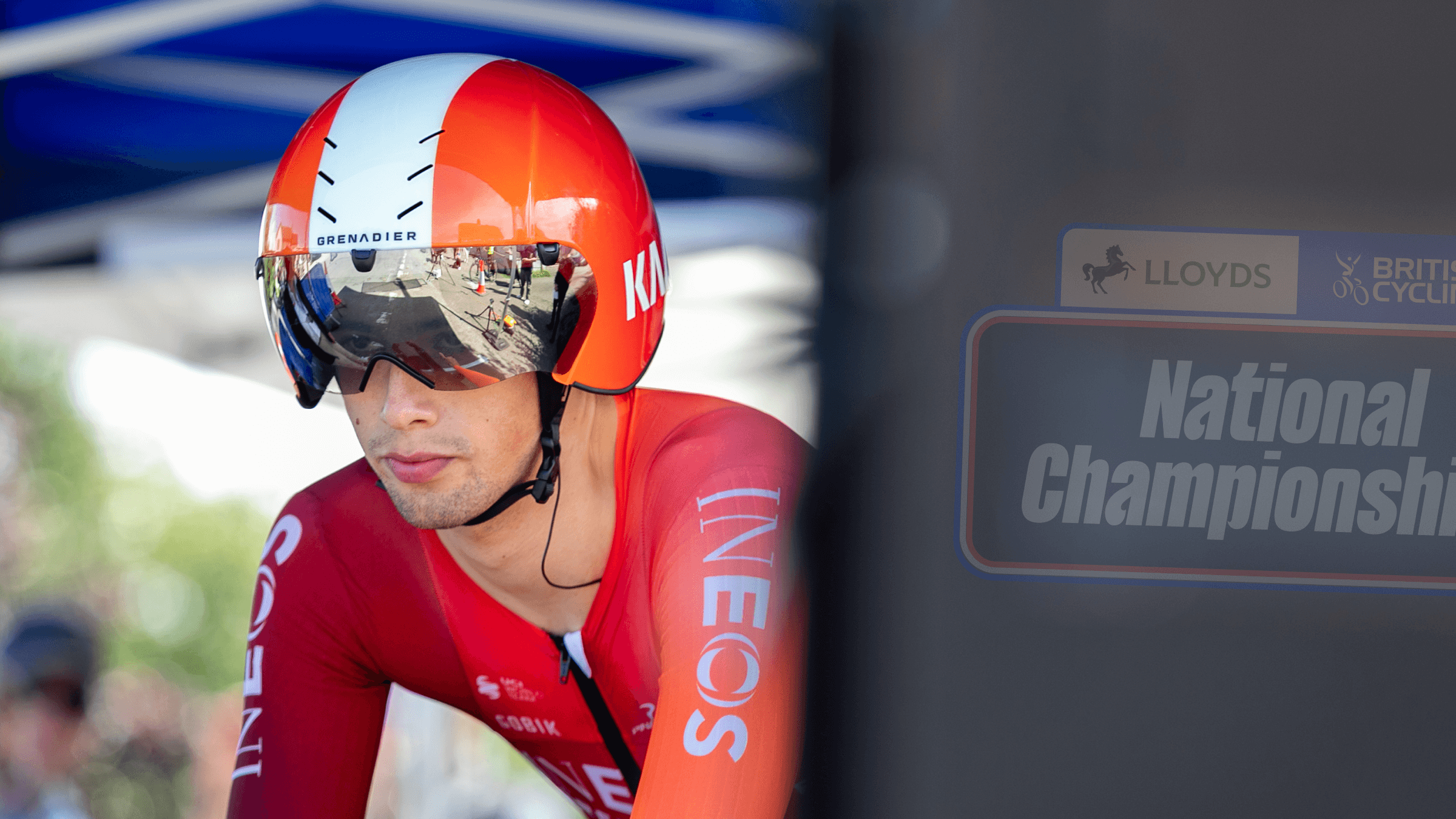
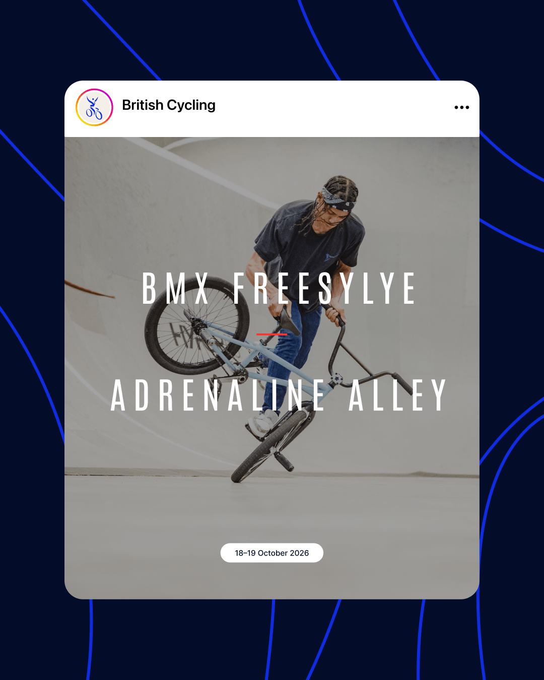
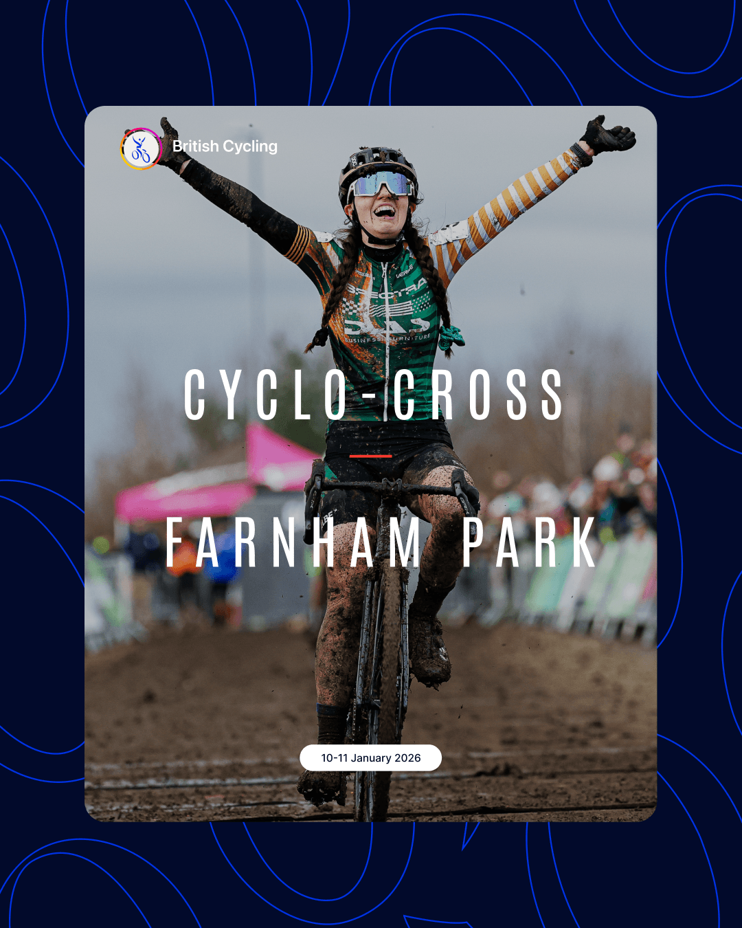
The final result is an identity that gives these events the stature they deserve, whether it is on a start-line banner or someone’s phone.
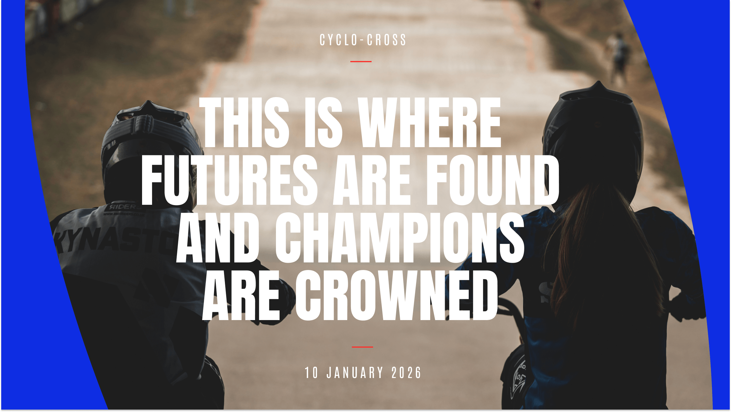
Because this is where talent meets opportunity. This is where futures are formed and where legends are made.
“It was a pleasure to work with FORM on the rebrand of our National Series and Championships and we’re thrilled with the end result. They listened, understood and delivered. The new look and feel has gone down a storm and delivered visible impact and value across our calendar of events.”
Ben Perry
Creative Director